Audio Calling
Audio Calling across Meta devices
For almost 3 years I owned and designed the Audio Calling domain across Wearable devices. This included shaping how voice interactions will work across different types of devices and later on, how visual inputs will look like. (worked across Portal, Meta Quest, Ray-Ban Stories, Ray-Ban Meta and Ray-Ban Meta Display)
Calling is directly tied to Meta's mission of giving people the power to build community and bring the world closer together. Our goal is to design a holistic and unified experience across different devices, focusing on creating a user centric experience that empowers people to effectively communicate.
Each Meta device has unique hardware constraints, input methods and form factors. Designing a unified calling experience meant rethinking traditional communication patterns to work seamlessly across glasses, headsets and displays, allowing users to stay present and live in the moment.
A cohesive multimodal experience across devices
I designed calling experiences across multiple Meta devices. Some were voice-first, like Ray-Ban Meta and Ray-Ban Stories, while others had screens, like Meta Quest, Portal and Ray-Ban Meta Display. Each device required its own balance of voice and visual design. With that in mind, conversational flows had to feel natural and fast on voice-first devices, while the devices that had screens needed a multimodal approach complementing voice with UI, confirmation and context.
1. Speed
The top priority for calling interactions is speed. Calling usually has an urgency driver and we want to prioritize quick and efficient communication by minimizing the time and steps required to initiate, answer and end calls.
2. Seamlessness
Strive for a seamless integration across smart glasses and smart phones creating a unified experience.
3. Integration with Ecosystem
Integrate and connect through our different family of apps as providers respecting a cohesive experience for smart glasses.
4. Confidence
Design with elements that instill confidence to our users on the UI and Voice, fostering trust in the calling experience.
5. Intuitiveness
Ensure a clear and concise interface that allows users to easily navigate and initiate calls without confusion.
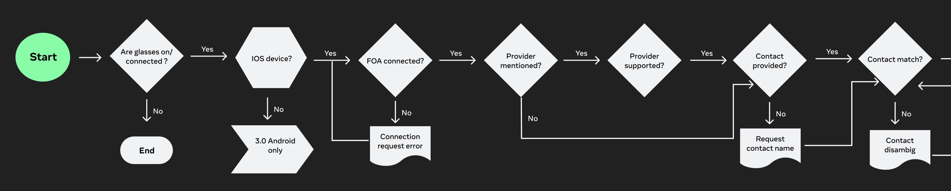
Model Based Dialog for Calling across Wearables
Starting with Meta Portal, I redesigned core patterns like contact disambiguation, enabling the system to dynamically interpret conversational signals, resolve ambiguity, and adapt to natural speech. This significantly improved fluency in high frequency tasks where traditional approaches often failed.
I defined key system tradeoffs and helped establish an end to end framework with data annotation, training signals, and evaluation metrics. We expanded success criteria beyond task completion to include recovery effectiveness and behavior under ambiguity, enabling continuous improvement from real usage.
This approach delivered measurable impact:
- 55% reduction in calling task failures.
- WhatsApp calling success increased from less than 60% to more than 80% on Portal.
- Stronger handling of ambiguity, task completion, and recovery
A core innovation was reframing failure as a recoverable state by selecting context aware strategies (clarification, contact suggestions) instead of ending interactions.
After validating on Portal, I drove adoption of model based dialog as the foundation for Calling across Ray-Ban Stories, Ray-Ban Meta, and Ray-Ban Meta Display, scaling a consistent interaction model and creating a baseline for multimodal experiences.
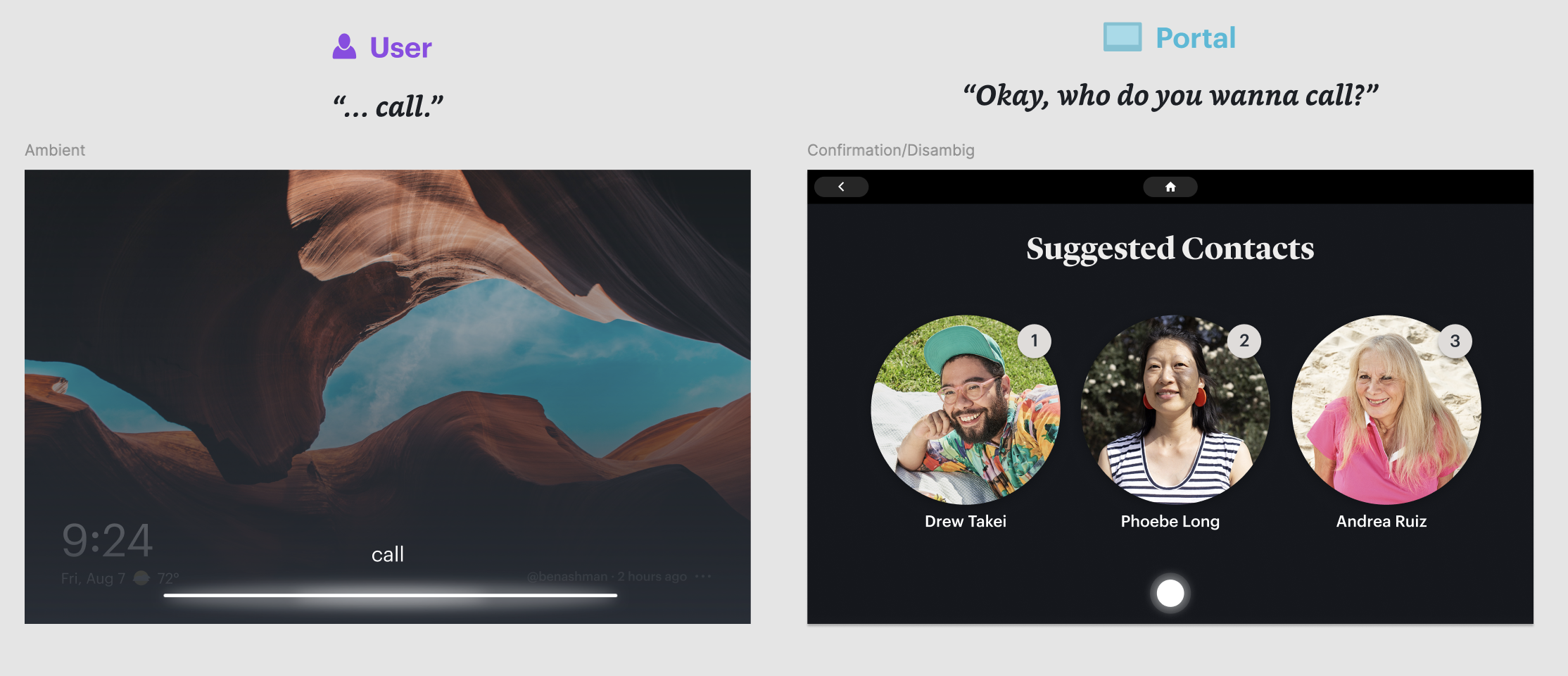
Meta Portal (multimodal experience)
Meta Portal was where the model based dialog system was first applied to calling. As a screen-based device, Portal required flows that combined voice interaction with visual UI, allowing users to see contact matches, call status and recovery options on screen while using voice as the primary input. This multimodal approach informed how we later adapted calling experiences to other devices in the ecosystem.
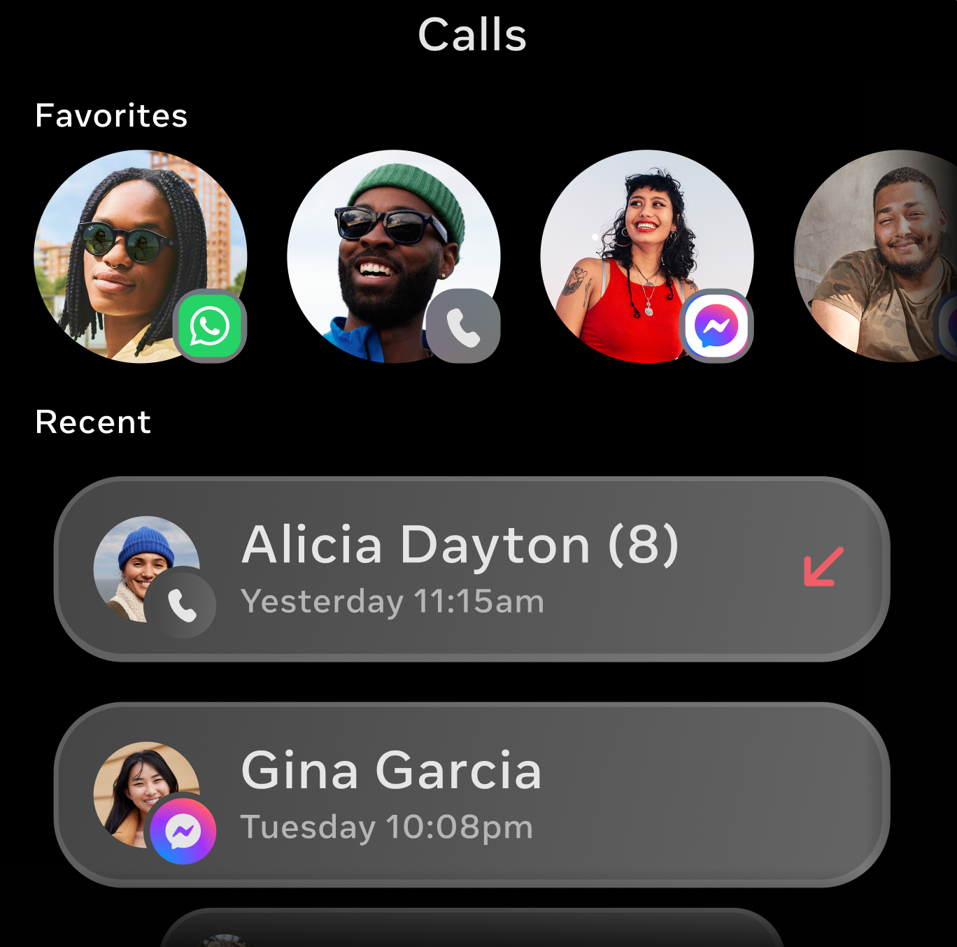
Ray-Ban Meta (voice-first experience)
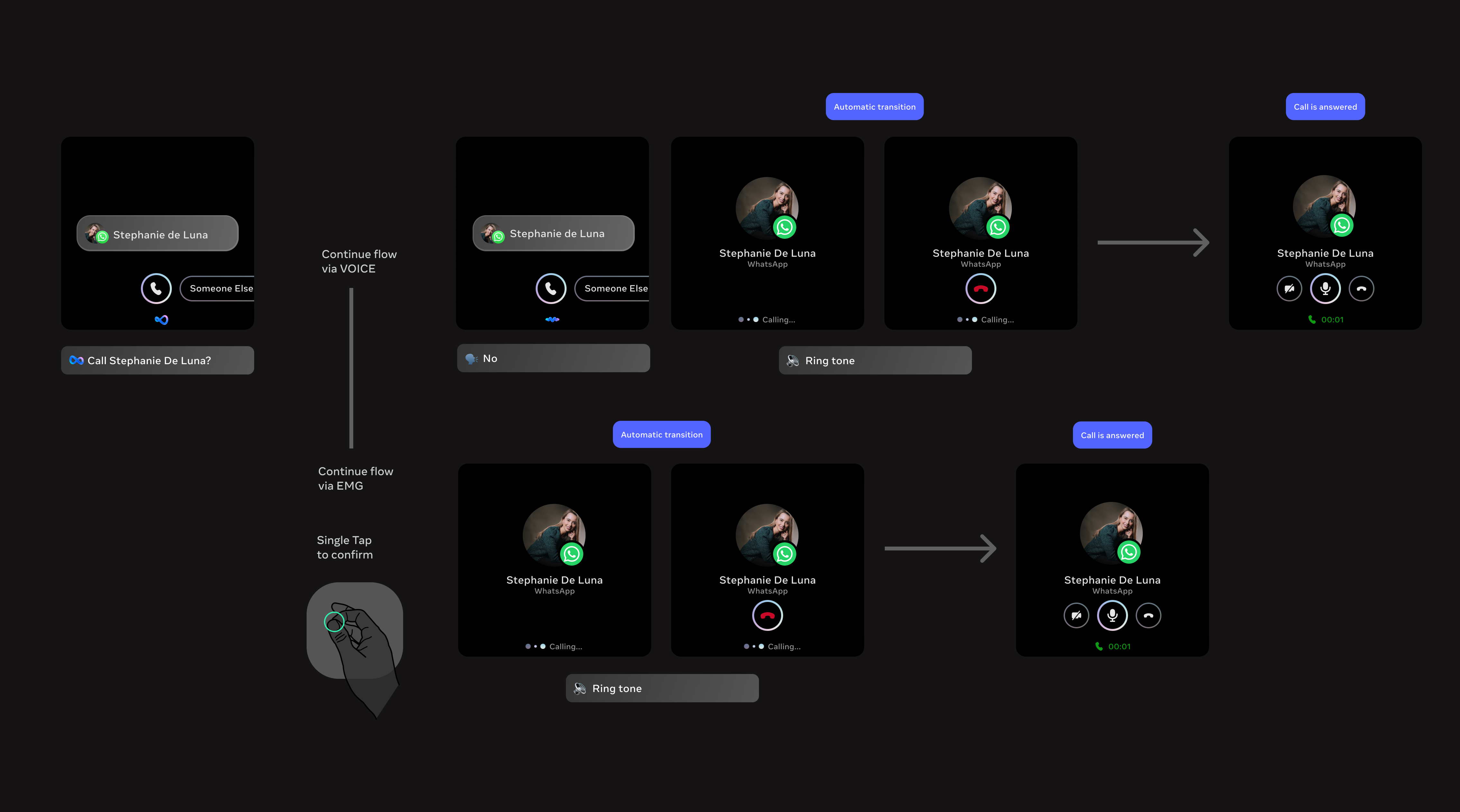
With the shift to a model based dialog system, traditional flow charts were no longer sufficient to define the interaction. Instead of doing deterministic paths, I redefined user flows as sample dialogues with a structured, end to end conversation that captured the dynamic exchange between the user and assistant.
These dialogs functioned as both design artifacts and training signals. Rather than mapping decisions step by step, they illustrated how the system should behave under different levels of ambiguity, partial input and real world language. This approach allowed us to get intent, tone and recovery strategies directly into the system, providing the model with richer context for decision making.
Each dialog showed the full lifecycle of an interaction, from initiation (e.g. placing a call) through disambiguation, task completion, and edge case handling. By designing flows as sample dialogs instead of static branches, we enabled the assistant to respond more naturally and consistently, even in scenarios that would be difficult to anticipate or specify.
Voice first interactions can be hard to navigate while trying to achieve a task like calling, which has an urgency that demands speed and accuracy. Placing a call to the wrong contact can generate anxiety or uncomfortable situations for users, especially when we consider Messenger (Facebook friends you may not have spoken to in years) or WhatsApp (close friends and family). Getting it right the first time matters.

A key part of the voice experience was designing recovery techniques with Model Based Dialog. When the assistant could not understand the user, the model would attempt to recover the conversation for a maximum of 2 turns before gracefully ending the interaction. This gave users a chance to clarify or rephrase without feeling stuck, while preventing frustrating loops. This approach significantly improved the overall calling experience.

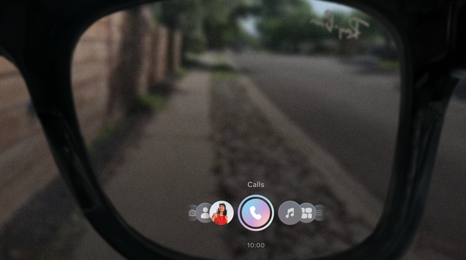
Ray-Ban Meta Display (multimodal experience)
With Ray-Ban Meta Display, user flows had to be reimagined for a multimodal experience combining voice, a heads up display and gestures. This was a unique design challenge since the display sits inside the lens and is visible directly in the user's field of vision, but it's extremely small, while wrist-based gesture input introduced a new modality. Every visual element had to be purposeful and glanceable, and flows had to account for three input methods: voice commands, wrist gestures and on-screen interactions, all working together seamlessly.
Key trade-offs
1. Speed vs. Accuracy in Disambiguation
Choosing between fast, implicit resolution (model confidence) vs. explicit user confirmation (visual or gesture input).
- Faster flows reduce friction
- Explicit confirmation reduces errors in high stakes actions like calling
2. Simplicity vs. Information Density
Designing for an ultra constrained heads up display required prioritizing simplicity and high signal visuals over detailed information.
- More information can improve clarity (e.g. disambiguation lists)
- Too much information breaks the heads up experience and increases cognitive load
3. Voice-first vs. Multimodal Balance
Determining when voice should lead vs. when to offload to visuals or gestures.
- Voice is expressive and natural for intent
- Over reliance on voice can be inefficient for selection, navigation or repeated actions
TTS shortening for Ray-Ban Meta launch
User feedback ahead of the Ray-Ban Meta launch revealed that text to speech responses were too long, creating friction in fast paced calling interactions. I led an effort to shorten TTS prompts across all calling flows, focusing on making responses concise and actionable while preserving clarity. Error messages were the primary focus, resulting in a 40% reduction in errors. Shorter, more direct responses helped users recover faster and complete calls with less confusion.